Risin’ Vibes Kitchen
One business, progressively becoming more itself.
Before new things,
a clearer idea.
The image felt outdated. The public face didn’t reflect the quality or personality of the kitchen. Touchpoints and operations weren’t working together cleanly.
An outdated image.
Disconnected touchpoints.
An inconsistent experience.
A face and an operation
that matched what
the kitchen actually provides.
The task began with reimagining RVK as a clearer, more coherent business.
The idea
found its face.
A new logo suite, custom lettering, and a shared visual language gave the direction a recognizable form.
A place to meet
the kitchen.
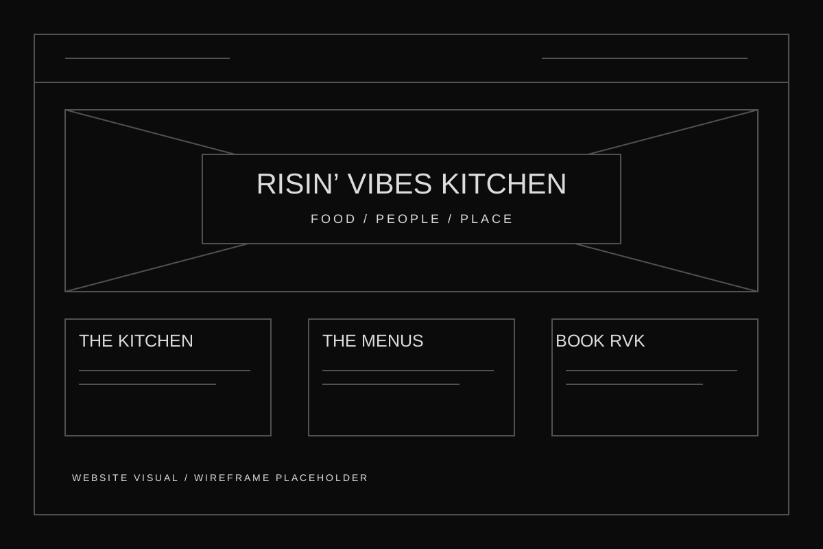
The identity became a website, menus, and customer-facing information. A way to explore RVK before arriving, ordering, or reaching out.
Out of the screen.
Into the world.
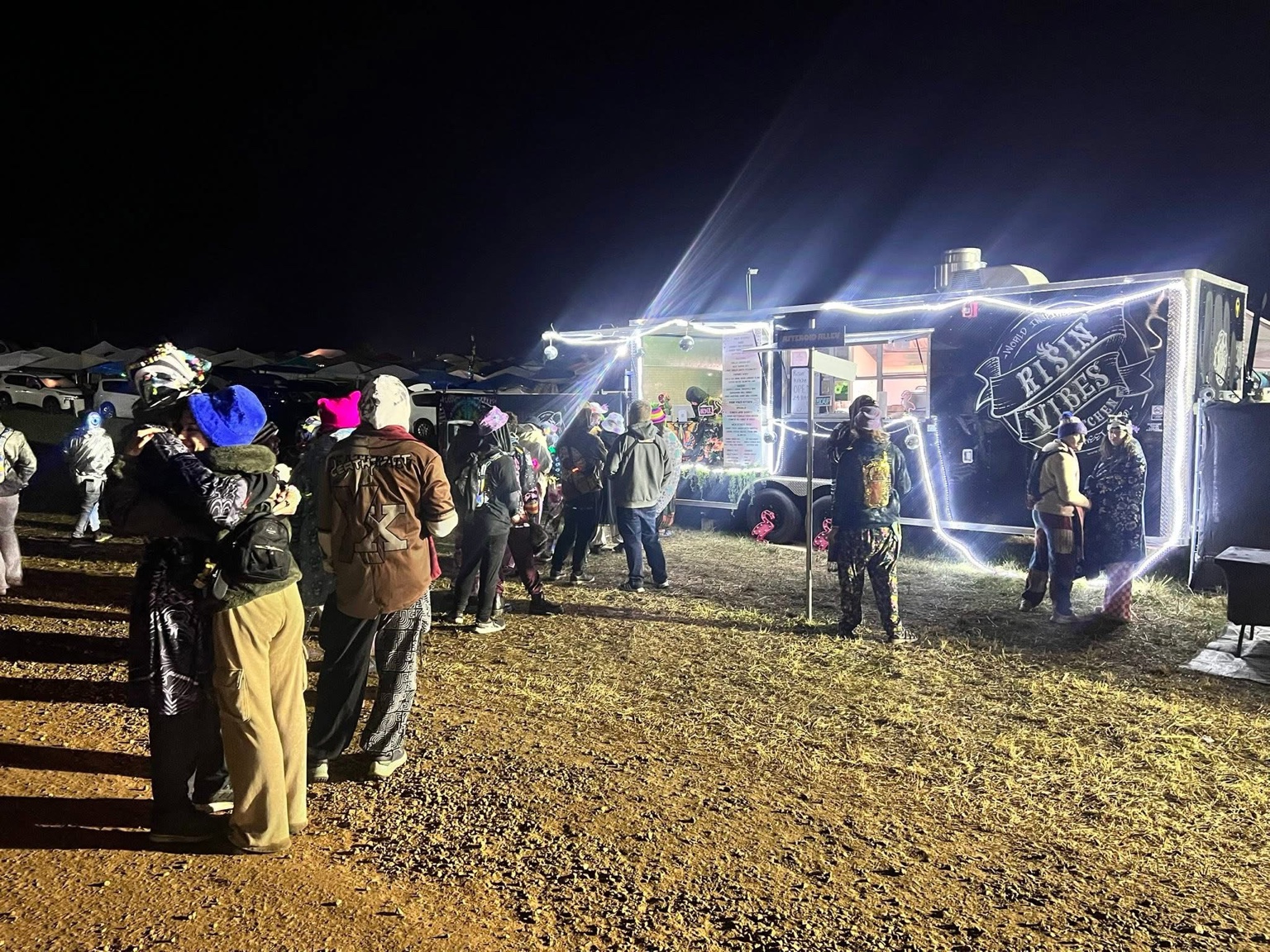
Apparel, printed menus, banners, and cards carried the same identity into things people could wear, hold, display, and use.
 APPAREL
RVK PROJECT VISUAL TO FOLLOW
 MENUS / PRINT
RVK PROJECT VISUAL TO FOLLOW
The pieces
found their purpose.
The website gives people a path to menus, business information, and contact. Staff resources carry the kitchen’s approach into the work behind the welcome.
Website → Menus
Find the offering.
Website → Book RVK
Take the next step.
Culture + Operating guidance
Bring the approach into the work.
& CultureHANDBOOK
VISUAL TO FOLLOW
HandbookSTAFF RESOURCE
VISUAL TO FOLLOW
The entire Spectrum.
One world.
One idea, recognizable in the identity, the website, the physical environment, and the way the business works.
EXPLORE RISIN’ VIBES KITCHEN ↗